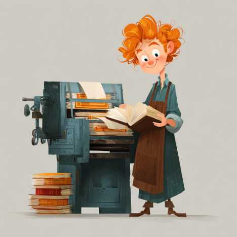
Hi, this is Cedar, and my job around here (ok, one of them) is to make things look pretty. You may be looking at the title of this article and wondering what an unreadable book is. Well, one typeset in Wingdings (which our publisher has declared to be a warcrime), or perhaps Comic Sans (which would make mimes cry. That’s just sad) would be unreadable. Or a book that isn’t comfortable to read, or… let me explain.
There is a fantastic upside for readers of ebooks. You can choose a lot of the parameters which make reading easier for you. You can set the font from your e-reader’s options, and the font size, so if you want large print, you can have it! This is a boon for the visually impaired, and I am all for it. You can read on a backlit screen (I read a lot on my phone) or you can get an eInk reader which will look almost like reading on paper, and can be read outside in the sunlight soakin’ up the rays on the beach. The other upside of an eInk reader is the battery life is phenomenal. All of this is great, and as I’m designing a Raconteur Press book for you, all I really have to worry about is making pretty scene divider graphics that will look great on the screen (and not have a weird white block around them).
Print is where it gets complicated. You see, not only do I want you readers to have the best reading experience, I want the book to look good. If you are investing in a paper book to keep on your shelves, taking up limited space, we are honored and want to respect that. Which is why we work hard at making the book readable and beautiful. This isn’t about covers – that is a whole ‘other article if you want it – this is about the interior, where the words live. Raconteur Press uses a program called Vellum for book layout, and when we get asked ‘what font do you use?’ the answer is ‘it depends’ because we typeset books to different styles. The styles are chosen to reflect the genre of the book. There’s a style we use for science fiction, and another for humor, and you get the idea. The fonts will vary subtly for all of those. For the Boy’s Books, there are fonts which are easier for dyslexic readers, and we lean into the styles that use those. All the font options are clean, very legible, and look good on the page. Font size? Well, we choose to typeset a little larger than average for readability, in general you can expect a 12pt font from us, down to 11 for the novels. For comparison, your Mass Market Paperback (MMPB) of yore was likely set in a 9pt font. We also leave a little room in the line spacing, which again helps it to be easier to read on the old eyeballs. Finally, we always use cream paper for our print books, reducing the eyestrain of the contrast between stark white and black print on the page.
For you writers, our new submission guidelines exist for a reason. While we don’t use Times New Roman for the books, it is an industry standard, and our concern when you send in your manuscript isn’t the final product, it’s the readability for our editors who are picking stories to include in anthologies (or novels!). The harder you make it on them, the less they are going to enjoy reading your story, and that doesn’t end well. The parts which make my life easier are the uses of headings for titles or chapters, and the asterisks for scene breaks. Those tell Vellum where to put things when I am importing the final manuscript, and if they aren’t right, I have a bad day. I appreciate you making them right.
There is a lot of thought that goes into the making of a book! From the submission of a story manuscript, to the final product you can hold in your hands, the goal is to make the reader’s experience seamless. We want the reader to sink into the story world seamlessly, and when they are done with their reading, we don’t want them to have an eyestrain headache. Just want them to be ready for picking up the next book, and the next.


I reviewed a book consisting of 50 flash fiction stories, each of which was set in a different typeface. It did not get many stars.
Asterisks *** vs +++ for scene breaks?